| Catalog Type Selector
|
Used to select from available
Catalog Types. Selections made here updates the
Catalog Item Selector combo box.
|
| Catalog Item Selector
|
Used to select from available
Catalog Items. The
Catalog Item Selector combo box contains
several options and settings designed to make it easier to find the exact
catalog item you need to place/change.
A generic
example of Catalog Item selector options for searching, grouping and
navigating
The
Catalog Item list also includes user
defined assemblies, and RFA catalog items, if any.
Note: When you make
your catalog item selection, it becomes the
active part the Family/Part Toolbar.
|
| Catalog Tools
|
A split button located to the right of the
Catalog Item Selector contains tools to
assist with managing catalog data prior to placement of selected catalog items.
Note: The
Save Catalog Item and
Save Catalog Item As... tools perform
administrative tasks on DataGroup System catalogs. Administrators and users may
want to hide the tool icons to avoid incidental or unwanted changes to their
firm's dataset by setting the user configuration variables
BB_CATALOGITEM_ADMIN_IN_PLACECMDS
and
BB_CATALOGITEM_SAVEAS_IN_PLACECMDS to "0", respectively.
|
| Preview
|
Displays the selected catalog item in the preview
window. This display changes and the preview updates as various options are
chosen. The preview also changes dynamically with some of the
prominent settings on the Placement tab, e.g Height, Rotation angle, etc. A
right-click in the Preview opens a
Show/Hide Viewing Tools option menu:
 Zoom In - Zooms in about center of
preview.
Zoom In - Zooms in about center of
preview.
 Zoom Out - Zooms out about center of
preview.
Zoom Out - Zooms out about center of
preview.
 Pan - Moves the preview following the
pointer. Click again to stop panning.
Pan - Moves the preview following the
pointer. Click again to stop panning.
 Fit - Fits the object to the extents of
the preview.
Fit - Fits the object to the extents of
the preview.
 Rotation - Sets the orientation of the
selected item in the preview to one of the standard orientation options:
Rotation - Sets the orientation of the
selected item in the preview to one of the standard orientation options:
- Isometric
- Right
Isometric
- Top
- Bottom
- Left
- Right
- Front
- Rear
 Display Mode - Sets the display of the
selected item in the preview to one of the standard display modes.
Display Mode - Sets the display of the
selected item in the preview to one of the standard display modes.
- Solid
- Wire
Frame
- Visible Edge
- Filled Visible
Edge
For
Place workflow, the
Hide/Show Preview controls displaying
preview of the element currently selected for placement.
|
| Properties list - toolbar
|
Used to manage catalog item properties during
placement or modification. Catalog item properties define the catalog item
instance in the model, and are accountable in the DataGroup System data
management tools. You can place a catalog item with its default property values
or you can change property values as needed, place an instance in the model,
and optionally save the changes to the catalog.
The Properties combo box contains tools for sorting
and searching the properties list:
 (Categorize) - When on, catalog
item properties are grouped in categories based on the catalog type
definitions. When off, the properties are listed alphabetically without
grouping. (Categorize) - When on, catalog
item properties are grouped in categories based on the catalog type
definitions. When off, the properties are listed alphabetically without
grouping.
 (Alphabetical) - When on,
catalog item properties are listed alphabetically without grouping. When off,
the properties are listed in categories. (Alphabetical) - When on,
catalog item properties are listed alphabetically without grouping. When off,
the properties are listed in categories.
 (Description) - Toggles a
description field at the bottom of the placement dialog listing information
about the highlighted catalog item property. The information listed includes
the property definition display name, internal name, and type definition. (Description) - Toggles a
description field at the bottom of the placement dialog listing information
about the highlighted catalog item property. The information listed includes
the property definition display name, internal name, and type definition.
-
Search
- Used to search for catalog item properties by
name. Results are dynamically updated in the properties list.
|
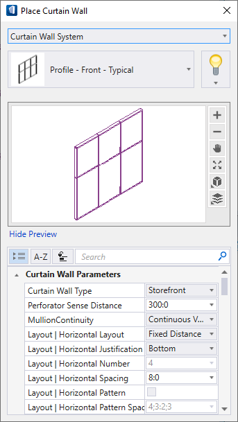
| Curtain Wall Parameters
|
Common properties of the curtain wall elements that
define the characteristics of the curtain wall type being placed:
| Setting | Description |
|---|
| Curtain Wall Type
|
Sets the type of the curtain wall being placed:
- Curtain Wall
- Storefront
- Ribbon Window
- Punched
Opening
|
| Perforator Sense Distance
|
Sets the distance over which the curtain wall
searches for a wall to perforate.
|
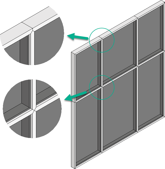
| Mullion Continuity
|
Manipulates the outer frame and layout of vertical and
horizontal mullions in the curtain wall.
- Continuous
Vertical - Constructs each internal vertical mullion as a
continuous vertical mullion.
- Continuous Vertical with
Continuous Frame - Constructs each internal vertical mullion as a
continuous vertical mullion with a continuous outer frame.
- Continuous
Horizontal - Constructs each internal horizontal mullion as a
continuous horizontal mullion.
- Continuous Horizontal with
Continuous Frame - Constructs each internal horizontal mullion as a
continuous horizontal mullion with a continuous outer frame.
- None Continuous
- Constructs all internal and frame mullions as single mullions connected with
miter joints.
Note: When modifying a curtain wall, for instance moving a
mullion to resize an individual panel, the selected mullion is treated as an
individual mullion segment regardless of whether it is a continuous mullion. If
there is a break in the continuous mullion, the remaining mullions are
re-constructed as a continuous mullion.
|
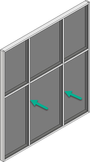
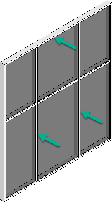
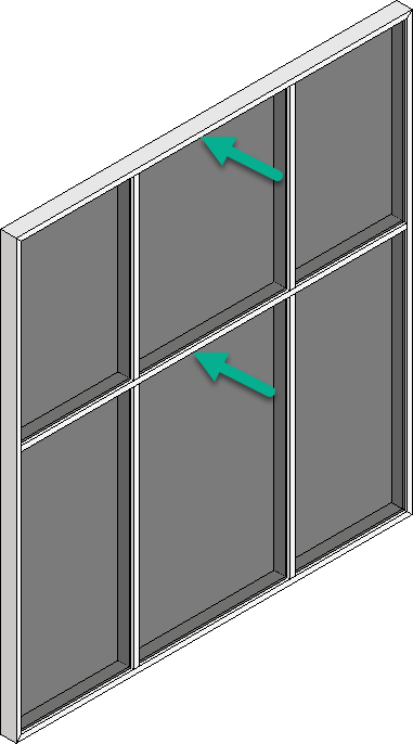
| Layout | Horizontal/Vertical Layout
|
Sets the horizontal and vertical layout. The
options selected here enable/disable other relevant layout parameters.
-
Maximum Spacing - Constructs the
curtain wall by dividing the total length/height of the curtain wall by the
value entered for the
Layout | Horizontal/Vertical
Spacing parameter to determine the panel layouts. The number of
panels is then rounded up to the nearest whole number, so the size of
the panel does not exceed the maximum horizontal spacing distance. This is
recalculated when the curtain wall is resized. For this option,
Layout | Horizontal/Vertical
Justification is not used because the panels are always centered in
the space available.
- Minimum Spacing
- Constructs the curtain wall by dividing the overall length/height of the
curtain wall by the value entered for the
Layout | Horizontal/Vertical
Spacing parameter to determine the panel layouts. The number of
panels is rounded down to the nearest whole number, so the size of the
panels are not below the minimum spacing distance. This is recalculated when
the curtain wall is resized. For this option,
Layout | Horizontal/Vertical
Justification is not used because the panels are always centered in
the space available.
- Fixed Distance
- Constructs the curtain wall with mullions placed at the value entered for the
Layout | Horizontal/Vertical
Spacing parameter, center to center. This usually causes an
odd-sized panel in one location.
Layout | Horizontal/Vertical
Justification determines where the spacing is started, which
results in the odd-sized panel to appear at the opposite end.
For example, if you start the spacing
from the Bottom, the odd-sized panel is at the top. If you select
Center or Middle, the odd-sized panel is split between the
top/bottom or the start/end of the curtain wall.
- Number of
Panels - Constructs the curtain wall by dividing the overall
curtain wall length/height by the value entered for the
Layout | Horizontal/Vertical
Number parameter.
|
| Layout | Horizontal/Vertical Justification
|
Sets the justification of the curtain wall.
Enabled for
Fixed Distance layout only. The other
layouts center the panels in both horizontal and vertical directions making
this option irrelevant.
- Top -
Constructs the curtain wall with the
Layout | Vertical Spacing starting
at the top downward until the bottom row where the remaining vertical space is
set as the vertical spacing.
- Middle -
Constructs the curtain wall with the
Layout | Vertical Spacing starting
at the middle outward until the top and bottom rows where the remaining
vertical space is divided in half and set as the vertical spacing.
- Bottom -
Constructs the curtain wall with the
Layout | Vertical Spacing starting
at the bottom upward until the top row where the remaining vertical space is
set as the vertical spacing.
- Start -
Constructs the curtain wall with the
Layout | Horizontal Spacing
starting at the start towards the end where the remaining horizontal space is
set as the horizontal spacing.
- Center -
Constructs the curtain wall with the
Layout | Horizontal Spacing
starting at the center outward until the start and end columns where the
remaining horizontal space is divided in half and set as the horizontal
spacing.
- End -
Constructs the curtain wall with the
Layout | Horizontal Spacing
starting at the end towards the start column where the remaining horizontal
space is set as the horizontal spacing.
|
| Layout | Horizontal/Vertical Number
|
Sets the number of panels in the respective
directions. Enabled for
Number of Panels layout. For example,
setting a 2 horizontal and 3 vertical panels will create a curtain wall system
having 2x3 mullion panels.
|
| Layout | Horizontal/Vertical Spacing
|
Sets the spacing between the panels in
respective direction. Enabled for
Maximum/Minimum Spacing
layouts.
|
| Layout | Horizontal/Vertical Pattern
|
When on, enables the
Layout | Horizontal/Vertical Pattern
Spacing parameters.
|
| Layout | Horizontal/Vertical Pattern Spacing
|
Sets the horizontal/vertical spacing based on
values entered using the following syntax:
[length/height 1];[length/height 2];[length/height
3];[length/height
n]. Each
length/height is separated with a semi colon < ; >. The number of
pattern elements is unlimited. This pattern then repeats over the length/height
of the curtain wall.
|
|
| Curtain Wall Properties
|
- Hurricane
Resistant
– When set, the curtain wall design adopts a
storm-proof structure. Here impact-resistant glass is used as inner-membrane
formed of a layer of polyvinyl butyral (PVB) between two slabs of glass. An
impact-resistant glass may shatter on impact, but it will remain attached to
the inner membrane along with the window frame.
|
| Identification
|
Lists identification properties for the active
catalog item type.
|
| Space Bounding
|
Lists properties that can be defined as
On/Off making the selected catalog item
eligible for consideration during energy analysis.
|
| Curtain Wall | Panel
|
- Panel
Type – Sets suitable panel type such as for glazing, spandrel
panels, parametric cell, etc. The selected panel type applies the dimension and
properties to the panel.
- Panel
Thickness – Sets the thickness to the selected panel.
- Panel
Offset - Sets an offset from the centerline of the curtain wall
glass panels.
Tip: You can use a parametric cell door as
a panel (and remove the mullion under it). The parametric cell panels, e.g.
FrostyGlass panel Or
Louvers are available for selection. To place
curtain walls without any panel assigned, select the "No Panel" as Panel Type.
You can also place small sized panel parametric cells
defined without restriction.
Note: The profiles listed for
selection below are specific to the Frame/Profile type.
|
| Curtain Wall | Mullion - Horizontal
|
Profile | Width | Depth – Set
profile and dimension of Horizontal mullions in respective position in the
frame.
|
| Curtain Wall | Mullion - Vertical
|
Profile | Width | Depth – Set profile and
dimension of Vertical mullions in respective position in the frame.
|
| Curtain Wall | Frame - Jamb
|
Profile | Width | Depth – Set
profile and dimension of Jamb in respective position in the frame.
|
| Curtain Wall | Frame - Head
|
- Same as
Jamb – When checked, the Head can be set same as selected Jamb
profile.
- Profile |
Width | Depth – Set profile and dimension of Head in respective
position in the frame.
|
| Curtain Wall | Frame - Sill
|
- Same as
Jamb – When checked, the Sill can be set same as selected Jamb
profile.
- Profile |
Width | Depth – Set profile and dimension of Sill in respective
position in the frame.
|
| Curtain Wall | Frame - Corner
|
Profile | Width | Depth – Set profile and
dimension of fixed Corners in respective position in the frame.
|
| Curtain Wall | Frame - Variable Corner
|
Profile | Width | Depth – Set
profile and dimension of Variable Corners in respective position in the frame.
|
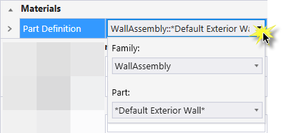
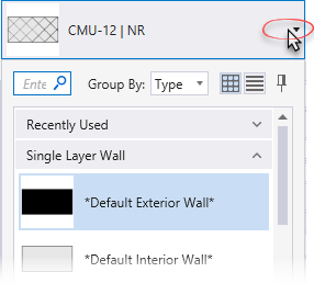
| Materials
|
Lists Part and Family definition assignments.
Clicking in the
Value column cell opens a Family and Part
selection box. Here parts and families are available from the option menus.
|
| Classification
|
Building Classification
Systems
are supported by the DataGroup System.
MasterFormat,
OmniClass, and
UniFormat property values can be
associated with any Building element. Click the
Value cell to open the Classification System
selection combo box. The combo box is populated with selected classification
system property values. It can be resized by clicking on the combo box's bottom
right corner. Search for properties by name. Search results are displayed in
the classifications hierarchy. Double click a property to select it. This
action also closes the selection menu. The selected property displays in the
selected classification system property value (on the Properties list).
|
 Used to place curtain wall
systems with a wide array of placement and material options. Curtain walls are
made from individual panels and framing components. Once placed, each
individual curtain wall component can be modified individually using
interactive pop up mini toolbars. For instance, framing components surrounding
a panel can be moved or removed by first selecting them, and then selecting one
of the mini toolbar options. The curtain wall system
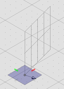
"heals" around modified panels. Placement options
allow you to place curtain walls with linear, arc or curved paths using
datapoints or by selecting the path elements, or by selecting bounding shapes
"flooded" with curtain wall. Curtain wall components
fully comply with the DataGroup system thus providing a detailed set of curtain
wall properties which are editable upon placement or after placement.
Used to place curtain wall
systems with a wide array of placement and material options. Curtain walls are
made from individual panels and framing components. Once placed, each
individual curtain wall component can be modified individually using
interactive pop up mini toolbars. For instance, framing components surrounding
a panel can be moved or removed by first selecting them, and then selecting one
of the mini toolbar options. The curtain wall system
"heals" around modified panels. Placement options
allow you to place curtain walls with linear, arc or curved paths using
datapoints or by selecting the path elements, or by selecting bounding shapes
"flooded" with curtain wall. Curtain wall components
fully comply with the DataGroup system thus providing a detailed set of curtain
wall properties which are editable upon placement or after placement.
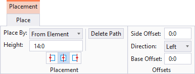
 Left -
Places the curtain wall to the top of the data point creation line.
Top in this case is relative to the
plan view orientation.
Left -
Places the curtain wall to the top of the data point creation line.
Top in this case is relative to the
plan view orientation.
 Center - Places the
curtain wall centered upon the data point creation line.
Center - Places the
curtain wall centered upon the data point creation line.
 Right -
Places the curtain wall to the bottom of the data point creation line.
Bottom in this case is relative to the
plan view orientation.
Right -
Places the curtain wall to the bottom of the data point creation line.
Bottom in this case is relative to the
plan view orientation.
 (
( (
( (
( (
( (
( (
( (
( (
( (
(