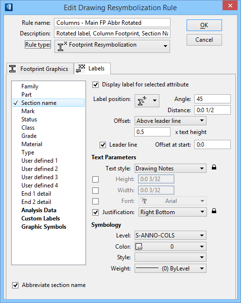
Labels tab
Used to specify the labels to appear on drawings. You will also specify the format and style of the labels. Labels can be extracted to the drawing, even if you are not applying any Structural specific resymbolization rules to the appearance of the members. That is, you can specify how you want the labels to show up in the drawings, even if you are letting the default drawing settings be used for the resymbolization of the members.
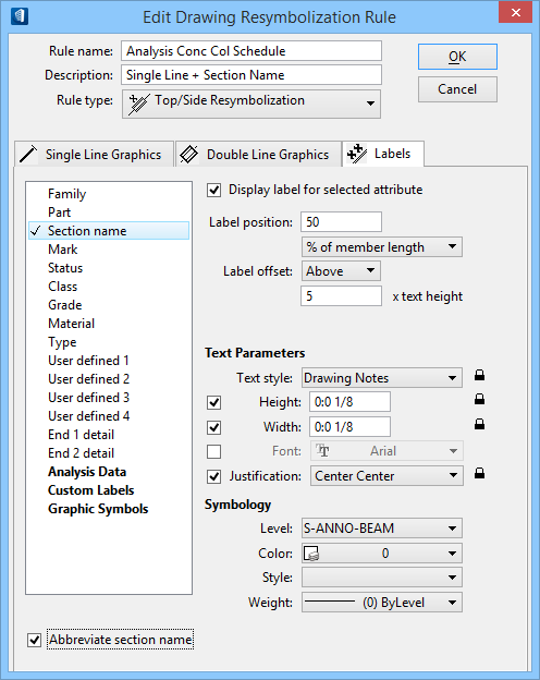
The text parameters can be locked for labels and custom labels. Lock the lock before you change a value and your changes will cascade through for all labels. Unlock the lock before you change a value and your changes will apply just for the active label. If you toggle a lock from open to closed and make no other changes, you are resetting the values for all labels to the active label. If you toggle a lock from closed to open and make no other changes, you do not modify any values.
You can override the Text Parameters of the label when you select a Text Style. A check box will appear to the left of each parameter below the text style. Turn the check box on and set the value. By opening or closing the lock at the right of the overridden parameter, you control if this override is for this one label or for all labels.You can override the Text Style by turning on the check boxes for the text height and width. This is especially important if you are importing files (such as AutoCAD) where the text height is zero. You can select a text style such as Engineering, override the default six-inch height, and enter a height of 0:0 3/32.
You can create custom labels that let you combine any of the attributes. A special type of custom label is one that can include stacked fractions. This functionality is explained in the section on Creating Stacked Fractions in a Custom Label.Common attribute label settings
The following describes common label settings for the first group of member attributes.
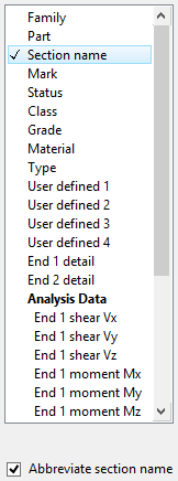
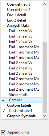
Custom Labels
You must first select or create a custom label to display its settings. If there are custom labels already defined, they are listed below the Custom Labels listing. Again, to create a custom label the Custom Labels attribute must be selected. When a custom label is selected, all the label placement options (for both top/side rules and footprint rules) are the same as if a regular member attribute had been selected except for the Display custom label and Label format settings.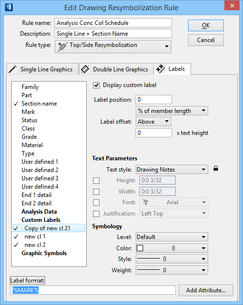
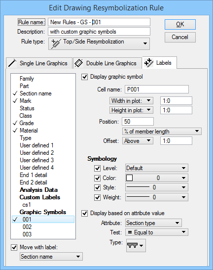
Graphic Symbols
| Setting | Description |
|---|---|
| Graphic Symbols (add new) | Before graphic symbol settings can be used, a graphic symbol has
to be created. Select the
Graphic Symbols attribute to enable the
graphic symbols creation options.
|
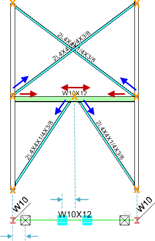
| Display graphic symbol | When on, the selected graphic symbol is included in the drawing.
Checking this option also enables the graphic symbol settings.
Note: Top/side and footprint rules share a number of placement
settings with labels from all member attribute types including custom labels.
Top/side label placement settings that appear on the Labels tab when a graphic
symbol is selected are the same as those found for the other attribute types.
Similarly, footprint label placement settings that appear
on the Labels tab when a graphic symbol is selected are the same as those found
for the other attribute types.
|
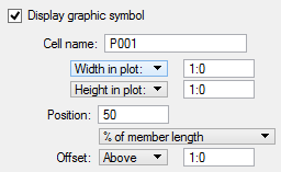
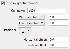
| Cell name | Used to enter the name of the graphic cell to be used in the graphic symbol. |
| Bracing Symbols | Replaces the
Cell name field when an
Attribute value of Vertical Bracing
is selected.
Lists the cells used for the three basic bracing connection types. There must be three cells: Up (BU) ,Down (BD), and Both (BB) in the list and the cells must exist in the current search path. The cell names are delimited with a semicolon. The first cell defines the bracing up cell. The second cell defines the bracing down cell. The third cell defines the bracing both up and down cell. |
| Width/Height in plot | Sets the plotted size of the Footprint graphic symbol. |
| Cell X/Y scale | Sets the plotted size based on scaling the graphic symbol cell in the X and Y directions. |
| Position | Used to enter a percentage or distance from value for Top/Side graphic symbols or to select a positioning icon from the option menu for Footprint graphic symbol. |
| Offset | Used to select the position of a Top/Side graphic symbol to be either Above or Below the resymbolized member. The field next to the Offset option menu is then used to enter the offset value to apply. |
| Horizontal/Vertical offset | Sets the plotted horizontal and vertical offset distances from the selected positioning icon of the Footprint graphic symbol. |
| Symbol Offset | Enabled for an Attribute value of Vertical Bracing. Sets the horizontal offset of the graphic symbol from the actual brace connection point. There are two options: |
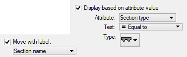
| Display based on attribute value | When on, the specified attribute will display the graphic symbol. For example, if you want this symbol to appear when the attribute End 1 detail is equal to FIXED, then you would turn on this check box and specify the settings. Checking this option enables the attribute value settings. |
| Attribute | Used to select the attribute that will display the graphic symbol. |
| Test | Used to select the test which will be applied to the attribute in
determining whether or not to display the graphic symbol. For example, if you
want this symbol to appear when a specific attribute is any value but FIXED,
you would select Not equal to and enter FIXED in the string. The selection of
tests changes depending on the attribute value chosen. For example, an
attribute of Section Name will let you test whether the value is equal to, not
equal to, blank, or not blank. But an attribute of Section Type will let you
set the Type (rather than String) to a symbol representing the section type.
|
| String | Used to enter the condition to meet based on the attribute and test values. For instance, Attribute: Section name 2, Test: = Equal to. |
| Value | Used to enter the value which must be met by the selected Test. For instance, Attribute: End 1 shear Vx, Test: > Greater than. |
| Minimum & Maximum | Used to enter the minimum and maximum values for a test of Between. For instance, Attribute: Camber, Test: Between. |
| Type | For an Attribute value of Section Type, select the Type of section which must be met by the selected test. Values are a range of steel and concrete types contained in a graphic value box. |
| Move with label | When on, your label will move with the graphic symbol for the attribute you select. When you are using the Move Structural Graphics tool, enabling this option will mean the graphic symbol and the selected attribute's label will be treated as a single entity. |
| Vertical Brace Dataset Part | Sets the dataset part
(Steel:Braces_Vertical) that is used to identify vertical
braces. Enabled for an
Attribute value of
Vertical Bracing.
Dataset Family and Part may be used to improve the qualification of linear members as vertical braces. For instance, if a Family and Part are set, then only linear members with this part will be considered as vertical braces. This is in addition to the other qualifying conditions. Being that the Vertical Brace Dataset Part setting is optional, if the Family or Part is not defined, the check is skipped and all vertical brace members are qualified for the geometric tests (based on geometry, orientation and connection location). |
| Tolerance | Sets the permissible distance in working units no less than one sub unit a vertical brace end point may be located away from the beam it braces to be qualified as a valid bracing configuration. It also represents the distance between two brace end points that should be considered as coincident such that they will be treated as an Above and Below brace of a Both configuration. The setting is used to provide an allowance for modeling where end points may not be exactly coincident. |
| Symbology | Label symbology override settings are the same as for labels for other member attribute types. Descriptions of these settings are found in the Edit Drawing Rule Labels tab. |