| Catalog Item Selector
|
Used to select from available
Catalog Items. The
Catalog Item Selector combo box contains
several options and settings designed to make it easier to find the exact
catalog item you need to place/change.

A generic
example of Catalog Item selector options for searching, grouping and
navigating
-
Search
- Used to search for catalog items by name.
Results are dynamically updated in the catalog items list. The searched text is
also highlighted in the results.
- Group
By: - Used to list catalog items in groups based on values assigned
to specific catalog item properties. Groups can be collapsed and expanded by
clicking the down/up arrows on the group name headers. For instance, selecting
for a wall catalog type creates groupings with
Schematic,
Partition,
WallComponent, etc headings. Catalog
items which have
Type defined as
Schematic,
Partition, or
WallComponent will be listed under
those headings. You can also select
to create a flat list with no grouping.
-
 (Large Icons) - Displays a
representative icon for each catalog item listing. (Large Icons) - Displays a
representative icon for each catalog item listing.
 (List) - Displays catalog item listings without any
icons. (List) - Displays catalog item listings without any
icons.
 - When selected, the
Catalog Item Selector combo box is
detached from the placement/modify dialog, and becomes a separate dialog. You
may prefer to have the floated dialog docked and always open over clicking the
Catalog Item Selector in the
placement/modify dialog for each catalog item selection. - When selected, the
Catalog Item Selector combo box is
detached from the placement/modify dialog, and becomes a separate dialog. You
may prefer to have the floated dialog docked and always open over clicking the
Catalog Item Selector in the
placement/modify dialog for each catalog item selection.
Note: The main
dialog still has the
Catalog Item Selector combo box so you
can select catalog items from either dialog.
Click the red
X to close the floated dialog.
- Recently
Used - Lists catalog items that were recently selected in a
"Group". This is useful because when you need
to repeatedly place or modify the same catalog items, you do not need to
repeatedly browse or search the main catalog items list.
Note: When you make
your catalog item selection, it becomes the
active part the Family/Part Toolbar.
|
| Catalog Tools
|
A split button located to the right of the
Catalog Item Selector contains tools to
assist with managing catalog data prior to placement of selected catalog items.
 (Refresh) - Synchronizes the interface with current
catalog content. Catalog libraries are updated to reflect newly added content
making them available in the tool settings dialog.
(Refresh) - Synchronizes the interface with current
catalog content. Catalog libraries are updated to reflect newly added content
making them available in the tool settings dialog.
-
 (Reset to
Defaults) - Resets the selected catalog item property values to the
default state as defined in the catalog library. (Reset to
Defaults) - Resets the selected catalog item property values to the
default state as defined in the catalog library.
 (Edit Catalog Item) - Used to edit the selected catalog
item. Opens the Catalog Editor, where you can create and edit new catalog types
and catalog items. Catalog Editor can also be used to edit existing data and to
view catalog item instance properties and values by definition.
(Edit Catalog Item) - Used to edit the selected catalog
item. Opens the Catalog Editor, where you can create and edit new catalog types
and catalog items. Catalog Editor can also be used to edit existing data and to
view catalog item instance properties and values by definition.
|
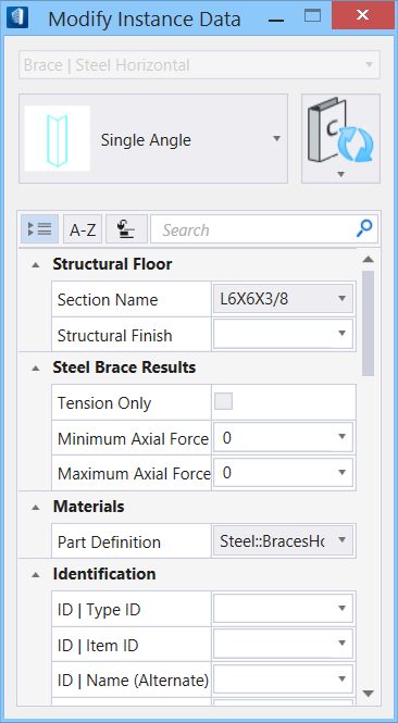
| Properties list - toolbar
|
Used to manage catalog item properties during
placement or modification. Catalog item properties define the catalog item
instance in the model, and are accountable in the DataGroup System data
management tools. You can place a catalog item with its default property values
or you can change property values as needed, place an instance in the model,
and optionally save the changes to the catalog.
The Properties combo box contains tools for sorting
and searching the properties list:
 (Categorize) - When on, catalog
item properties are grouped in categories based on the catalog type
definitions. When off, the properties are listed alphabetically without
grouping. (Categorize) - When on, catalog
item properties are grouped in categories based on the catalog type
definitions. When off, the properties are listed alphabetically without
grouping.
 (Alphabetical) - When on,
catalog item properties are listed alphabetically without grouping. When off,
the properties are listed in categories. (Alphabetical) - When on,
catalog item properties are listed alphabetically without grouping. When off,
the properties are listed in categories.
 (Description) - Toggles a
description field at the bottom of the placement dialog listing information
about the highlighted catalog item property. The information listed includes
the property definition display name, internal name, and type definition. (Description) - Toggles a
description field at the bottom of the placement dialog listing information
about the highlighted catalog item property. The information listed includes
the property definition display name, internal name, and type definition.
-
Search
- Used to search for catalog item properties by
name. Results are dynamically updated in the properties list.
|
| Properties list - table
|
Information in the
Value column rows can be completed by
selecting the applicable cell to activate an editor field, an option menu, or a
pop up dialog. This data is written to the element properties. Properties
displayed with grey text are read only. The dividing bar between the
Property, and
Value columns can be moved to change the
width of either area, or resize the dialog. A vertical and horizontal scroll
bars are available to scroll and adjust
Properties panel viewing and the display of
data.
The Property categories vary and are based on current element
and the discipline. For example, the element attributed to instance of
Structural Slabs, Structural Wall inherit properties of slab and wall catalogs,
respectively.
Some of commonly available property categories are:
- Air Handling
- Classification
- Construction Phase
- Identification
- IFC Override
- Insulation/Lining
Symbology parameters
- Electric System Data
- Fireproofing
- LEED Parameters
- Material
- Structural Floor
- Structural Usage
- Quantities
- Panel Parameters
- Transformer Schedule
- Lighting Parameters
- Electrical BOQ
- Equipment Schedule
etc.
Note: For exact property categories refer to respective component's
placement/modify tool.
|
 Used to modify drawing elements not associated with an
application catalog type, and are attributed building instance data.
The dialog also opens when Electrical Symbol elements are selected
for modifying properties. The property values displayed are those from the
selected element(s). The property categories vary with type of components and
in selection and what catalog type attributes were added to it.
Used to modify drawing elements not associated with an
application catalog type, and are attributed building instance data.
The dialog also opens when Electrical Symbol elements are selected
for modifying properties. The property values displayed are those from the
selected element(s). The property categories vary with type of components and
in selection and what catalog type attributes were added to it.