| File Menu
|
The following commands are available from the
Report Template Designer File menu:
-
New - Displays the New Report Template
dialog, which enables you to create a new Report Template.
-
Open - Displays the Open Report
Template dialog, which enables you to open an existing Report Template for
editing.
-
Save - Saves changes to the current
Report Template.
-
Save As - Enables you to save the
current Report Template as a different name.
-
Exit - Closes the Report Template
Wizard.
|
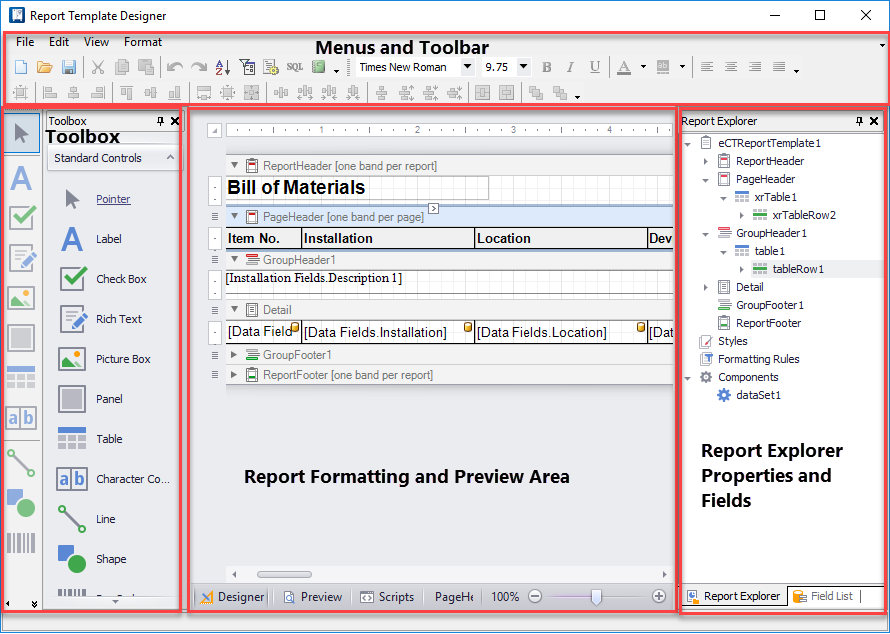
| Menus and Toolbar
|
Provides access to major file-handling and formatting
functions.
|
| Toolbox
|
Provides a selection of standard controls that you
can drag into the report template. To use them, drag them into one of the bands
in the report formatting area. Once there, you can select them and format them
in the
Property Grid tab like other report
elements.
-
Pointer - A tool that allows you to
select bands and report elements.
-
Label - Inserts a label in reports.
Use this control to place single-line or multi-line text in a report.
-
Check-box - Inserts a check-box in
reports. Use this control to allow a user to display a true/false or
Checked/Unchecked/Indeterminate state.
-
RichTextBox - Inserts a control that
can be used to display, enter, and manipulate formatted text.
-
PictureBox - Inserts a control that
can be used to insert images into your report.
-
Panel - Inserts a control that can
contain other controls. Use this control to group controls together which makes
it easier to manipulate them.
-
Table - Inserts a table into the
reports.
-
Line - This control places a line in
your report.
- Shape - Inserts a shape into the report. The type of shape
can be defined in the Property Grid.
-
Barcode - Represents a barcode in
reports.
-
ZipCode - Inserts a control that
displays a zip code in a report.
-
Chart - Inserts a chart in reports.
Use this control to show different data in a report using one or several Series
View Types. A chart wizard allows you to format the chart once inserted.
-
PageInfo - Use this control to
display auxiliary information on report pages such as page numbers, the current
date or user information.
-
PageBreak - Inserts a page delimiter
into the report.
-
Subreport - Subreport controls are
used if there is a particular report structure that needs to be included in
many reports and it needs to have a consistent appearance and functionality. A
good example is a report header that always contains the same company
information, who generated the report, the date, etc.
|
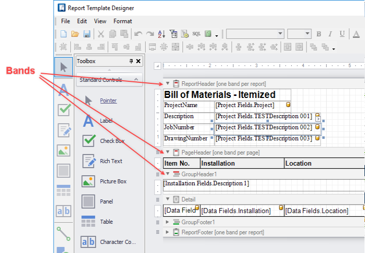
| Report Formatting and Preview
|
The central area of the dialog is where you place
and arrange the elements of the report. Select the
Designer tab at the bottom of this area
when you are placing or editing report elements. The report formatting area is
divided into horizontal bands that represent different parts of the report page
(header, body, footer, etc.). Select the
Preview or
HTML View tabs when you wish to see what
the report output will look like. If you have a page open, data from that
project will appear in the preview.
Create the bands that will make up the main areas
of the report page. The different bands are marked by horizontal bars with the
name of the band type.
The following band types are available:
-
TopMargin - The area defined by the
top margin value. Used for placing content at the top of each report page.
-
ReportHeader - For content that will
only appear at the beginning of the first page of the report, below the top
margin.
-
PageHeader - Used for placing content
at the top of a report page, below the TopMargin. Mainly intended for
displaying the header of a table, which has been continued from the previous
page.
-
Detail - The main content area of the
report.
-
GroupHeader - A header for a
sub-section of data within the
Detail band of the report (example:
one cable within a field wiring report). The group header appears above the
Detail band.
-
GroupFooter - A footer for a
sub-section of data within the
Detail band of the report. Appears
below the
Detail band.
- ReportFooter - Used
for placing content at the end of a report.
-
PageFooter - Used for placing content
at the bottom of a report page, above the
BottomMargin band. Mainly intended for
displaying the footer of a table, which is continued on the following page.
-
BottomMargin - An area defined by the
bottom margin value. Used for placing content at the bottom of each report
page.
|
| Report Explorer, Properties and Fields
|
On the right side of the dialog is an area that has
several purposes. Select the
Report Explorer tab to see an outline
view of the report's structure and the elements used in the report. You can use
this view to select individual fields or controls and view their properties or
delete them by means of the right-click menu. Select the
Property Grid tab to set the properties
of the currently selected report element. Select the
Field List tab to display a list of
available data fields. You can drag these fields into the report formatting
area.
You can adjust the size of these dialog areas by
pointing the cursor at the edge of the area and dragging. You can close the
dialog area by clicking on the
X button for that area and re-display it
using the
menu. You can drag the Toolbox and the
Report Explorer/Fields/Property Grid
area so that they are free-floating windows. To dock them again with the
Report Template dialog, drag them to
either the right or left end of the ruler bar.
|
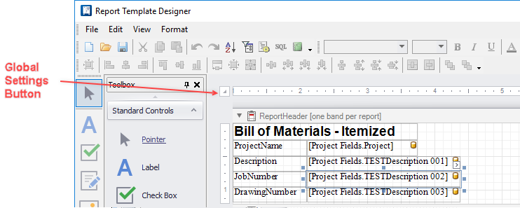
| Global Settings for the Report
|
When you select the button, a limited group of
fields will appear beside the button. However, you can select the
Property Grid
tab and access all global settings for the report.
Note: You must
select the global settings button first before you will see these fields in the
Property Grid tab. The properties which display here are subject to change
depending on the type of report template loaded.
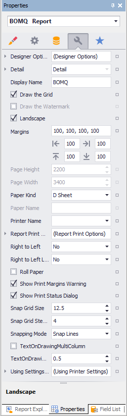
-
Landscape - Select True in this field
if you wish the report to be in landscape mode. Select
False if you wish the report to be in
portrait mode.
-
Margins - Sets the page margins for
the report. If you click the + icon beside the Margins field, you will see
separate fields for top, bottom, right and left margins.
-
PageHeight, PageWidth - Set the paper
size here. Units are hundredths of an inch or tenths of a millimeter as set in
the
Report Unit field.
-
Report Unit
- Here you select whether the space units you enter for
margins, paper size, etc., will represent hundredths of an inch or tenths of a
millimeter.
-
TextOnDrawingMultiColumn - If the
template is for a
Text on Drawing report, select
True if you wish the report to occupy
multiple columns on the drawing page. Select
False for the report to appear within a
single column.
-
TextOnDrawingSpaceBetweenColumns - If
the template is for a
Text on Drawing report that will
occupy multiple columns on a drawing page, enter a value for the gap between
columns.
|
| Preview Tab
|
If you have a drawing page open, data from that
project will appear in the preview.
|
 The
Report Template Designer lets the user create
custom report formats.
The
Report Template Designer lets the user create
custom report formats.