Place User Cell Dialog
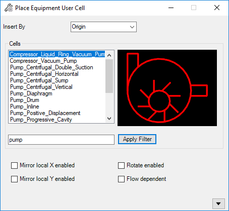
The Place User Cell dialog similar to the one shown below displays whenever you want to place components using a User Cell component class.
Access when a User Cell component option is selected from the User Cells gallery.
The following dialog displays:
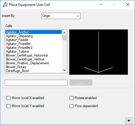
The User Cell Class is created in the Class Editor and is linked to a .Cel library which stores the individual component cells. For a normal cell based component, a specific CellName is defined when the component class is created. When creating a User Cell Class, the CellName field is not defined. Because of this, the dialog displays when a User Cell Placement option is selected. It provides a list of component cells available in the .Cel library for the user to choose from.
| Setting | Description |
|---|---|
| Insert By | Select the insertion point on the component to use for placement. The options available in this list will change depending on the component chosen and the insertion/connection points which were defined for the component. |
| Cells | Select the desired component cell. A graphic image of the component displays in the preview pane. |
| Mirror local X/Y enabled |
When enabled, you have the option to place the component as its shown in the preview pane, or as a mirror image of the preview by clicking a point to the left or right of the component upon placement. |
| Rotate enabled | When enabled, you have the option to rotate the component to the correct placement position. |
| Flow dependent | This option is only applicable to inline components where the flow of the component is derived from the flow of the line it is placed on. |