Supports
The Supports Tool Group provides the following options to place, edit and manipulate supports for the raceway components:
- Center Hung Tray Supports
- Trapeze Tray Support
- Single Channel Bracket Support
- Double Channel Bracket Support
- Single Channel Bracket with Brace Support
- Edit Component Properties
- Component Manipulator
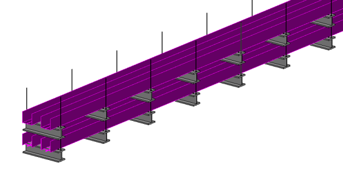
Center Hung and Trapeze Supports
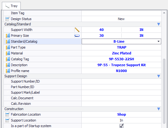
The Center Hung and Trapeze tray supports are designed as a hanging support which connect to a structure overhead. With these supports, the Properties dialog provides options to define the parameters of the support bar and the hanging rods as shown below with the Trapeze support:
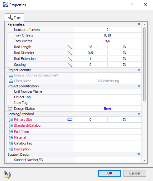
In the dialog, the definable fields under the Parameters section determine the dimensions of the support.
| Setting | Description |
|---|---|
| Rod Length | Defines the length of the rods used for either the Trapeze or Center hung supports. |
| Rod Diameter | Defines the rod diameter. |
| Rod Extension | Defines the distance beyond the support frame the rod(s) will extend when placing either Trapeze or Center hung supports. |
| Rod Inset | For Trapeze supports, defines the distance from the end of the support frame the rod is inset. |
| Spacing | This defines the space in between supports along the length of the selected tray. If the value is 0, then a single support is placed. If a value is defined here, for example 48", then a support will be placed every 48" along the length of the tray. |
Once you have defined the parameters, click OK to determine the location along the selected tray(s) to place the support.
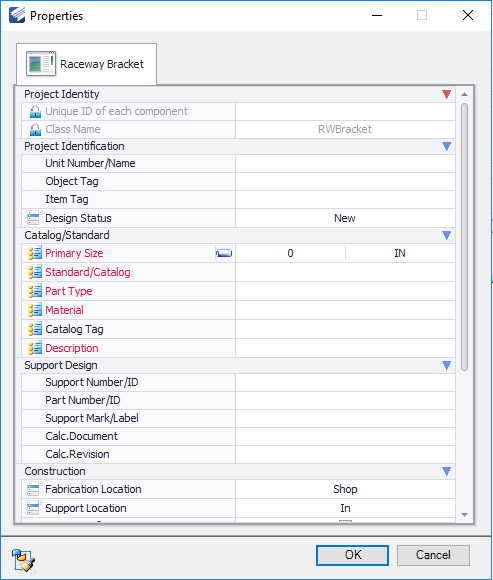
Bracket Tray Supports
Bracket Tray supports are cantilever supports, which are usually anchored to a support beam or wall. When any of these support options are used, the Properties dialog provides more options to define the type of steel support to use as well as additional options which determine how the support is placed.
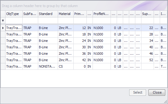
This grid display all of the catalog records for the type of component you selected to place.
The columns in the grid can be expanded for a better view of the headers and the values within.
Select a record from the grid to apply its values in the Properties dialog. When a record is selected, the default preset values are applied to the dialog fields where required.
The resulting new values are displayed in Blue in the dialog as shown:
Each header has a drop down filter list allowing you to filter the grid according to the selected filter value. For instance, the following filter list is displayed from the Standard (Catalog) column:
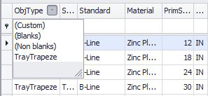
If you click the Custom option, it will display the Custom Auto Filter dialog allowing you to create a custom filter for the grid.