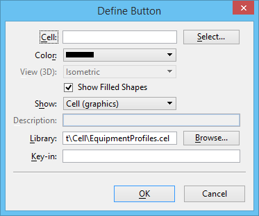
Define Button Dialog
Used to add a cell to a cell selector file and to define the cell's button. The cell is inserted on the button following the button that has focus.
The default settings in this dialog come from the Define Defaults dialog but they can be changed when you add a cell and define its button.
| Setting | Description |
|---|---|
| Cell | Sets the name of the cell to be inserted on the button. |
| Select | Opens the Select Cell dialog, which is used to select the cell to be edited. The cells and the pattern descriptions listed reflect those associated with the cell named in the Configure Cell Selector Button dialog. |
| Color | Opens a list box that allows you to select a color for the button to be inserted. |
| View (3D) | Allows you to select the orientation in which 3D cells appear. The choices are Top, Bottom, Left, Right, Front, Back, and Isometric. |
| Show Filled Shapes | If on (the default), filled shapes in a cell appear as filled on the button. |
| Show | Opens a list box that allows you to select how you want the cell to appear on the button in the Cell Selector dialog. The choices are Cell (graphics), Cell Name, Description, and Cell and Name. |
| Description | Displays a description of the cell. |
| Library | Displays the cell library associated with the cell to be inserted. You can key in a specific cell library name or click the Browse button to open the Select Cell Library dialog. |
| Browse | Opens the Select Cell Library dialog, which is used to select the cell library associated with the named cell. If one is selected and saved, it then appears in the Library text box. |
| Key-in | Displays the key-in associated with the cell to be inserted. This text box can contain up to 511 characters. Alphabetic, numeric, and special characters are valid. |