|
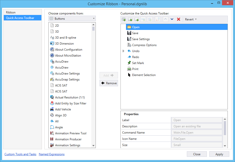
Choose components from
|
Allows you to select the desired component type from the drop-down lists. Depending on the component type the items are listed below the drop-down list. |
| Add |
Adds the item selected in the Choose components from list to the Quick Access Toolbar. |
| Remove |
Removes the item selected in the Customize the Quick Access Toolbar list. |
| Customize the Quick Access Toolbar |
Lists the items that will be displayed in the Quick Access Toolbar. |
| New Button
|
Creates a new button.
|
| New Split Button |
Creates a new split button. |
| New Drop-down button |
Creates a new drop-down button. |
| New Menu Item
|
Creates a new menu-item in the selected split button or
drop-down button.
|
| New sub-menu
|
Creates a sub-menu within the selected split button or
drop-down button.
|
| Rename
|
Allows you to rename the selected item.
|
| Move Up
|
Moves the selected item up.
|
| Move Down
|
Moves the selected item down.
|
| Remove
|
Removes the selected item. If the item is a delivered ribbon
component, it is striked-through from the list.
The action is completed only when you click
Apply.
|
| Revert
|
Resets or removes the customization. Following are
the options:
- Revert customization
for selected Ribbon Item - (Available only for customizations made to delivered
ribbon components) Removes the customization made to the selected ribbon item.
- Revert all Ribbon
customizations - Removes all the ribbon customizations.
|
| Properties |
Depending on the item select in the Customize the Ribbon list, different properties are displayed in this section.
- Label - Label of the
item.
- Description -
(Available for new buttons and menu-items) Allows you to enter a description
for the new button.
- Key-in - (Available
for new buttons and menu-items) Allows you to enter the key-in that should be
executed when the button is selected.
- Icon Name -
(Available for new buttons and menu-items) Allows you to change the icon of the
button or menu-item. Clicking the Browse button on the right-side of the field
opens the Define Icon for Tool dialog, from where you can select the icon for
the new button or menu-item.
- Show Label Only -
(Available for new buttons) If on, displays only the label of the new button.
This can be used when you do not want to define icons for each button.
- Visibility -
(Available for custom items) Allows you to set the visibility expression of the
selected item.
Note: The
Visibility property holds the name of a named expression that will be evaluated
each time the active model is changed to determine whether the item should be
displayed. The named expression should return a boolean (True or False) result
in order to work properly as a Visibility property.
- Enable - (Available
for new buttons, drop-down buttons, and split buttons) Allows you to enable or
disable the selected item based on the result of named expression selected in
the drop-down menu. The named expression should return a boolean (True or
False) result in order to work properly as a enable/disable property.
- SyncItemEvent -
Defines when the expressions should be reevaluated to update the enable or
visibility state of the item. If nothing is set, the default is to reevaluate
the expression when the active model is changed.
- Margin - (Available
for tools) Displays the margin between tools. The margin changes when you
select Adjust Button Spacing > Add Spacing from the Panel's right-click
menu.
- Source - The source
file of the item. For the items delivered with
OpenBuildings Speedikon, the file name is
MstnRibbon.rsc.
|
| Pop-up menu options |
Depending on the item you select in the Customize the Ribbon list, you will get different right-click options.
- Add New Button -
Creates a new button.
- Add New Split-Button
- Creates a new split button in the selected group.
- Add New Drop-down Button - Creates a new drop-down button.
- Add New Sub-menu
item - Creates a new menu-item in the selected split button or drop-down
button.
- Add New Sub-menu -
Creates a sub-menu within the selected split button or drop-down button.
- Rename - Allows you
to rename the selected item.
- Remove - Removes the
selected item.
- Move Up - Moves the
selected item up.
- Move Down - Moves
the selected item down.
|