|
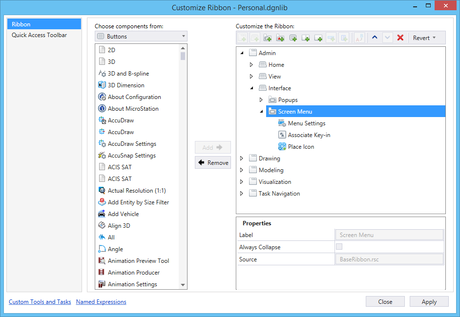
Choose components from
|
Allows you to select the desired component type from
the drop-down list. Depending on the component type the items are listed below
the drop-down list.
|
| Add
|
Adds the item selected in the
Choose components from
list to the workflow, tab, or group in the
Customize the Ribbon
list. The item is added below the item selected in the
Customize the Ribbon.
|
| Remove
|
Removes the item selected in the
Customize the Ribbon
list.
|
| Customize the Ribbon list
|
Lists the items that will be displayed in the ribbon.
|
| New Workflow
|
Adds a new workflow.
|
| New Tab
|
Creates a new tab in the selected workflow. Also creates a
new group in the new tab.
|
| New Group
|
Creates a new group in the selected tab.
|
| New Panel
|
Creates a new panel in the selected group.
|
| New Button
|
Creates a new button.
|
| New Split Button
|
Creates a new split button in the selected group.
|
| New Drop-down button
|
Creates a new drop-down button in the selected group.
|
| New Menu Item
|
Creates a new menu-item in the selected split button or
drop-down button.
|
| New sub-menu
|
Creates a sub-menu within the selected split button or
drop-down button.
|
| Rename
|
Allows you to rename the selected item.
|
| Move Up
|
Moves the selected item up.
|
| Move Down
|
Moves the selected item down.
|
| Remove
|
Removes the selected item. If the item is a delivered ribbon
component, it is striked-through from the list.
The action is completed only when you click
Apply.
|
| Revert
|
Resets or removes the customization. Following are
the options:
- Revert customization
for selected Ribbon Item - (Available only for customizations made to delivered
ribbon components) Removes the customization made to the selected ribbon item.
- Revert all Ribbon
customizations - Removes all the ribbon customizations.
|
| Properties
|
Depending on the item selected in the
Customize the Ribbon
list, different properties are displayed in this section.
- Label - Label of the
item.
- Description -
(Available for new buttons and menu-items) Allows you to enter a description
for the new button.
- Key-in - (Available
for new buttons and menu-items) Allows you to enter the key-in that should be
executed when the button is selected.
- Panel Type -
(Available for panels) Allows you to set the alignment of buttons in the panel.
Options are:
- Horizontal -
Aligns the buttons in the panel horizontally. Horizontal panels are fixed size
and do not change with ribbon resize.
- Vertical -
Aligns the buttons in the panel vertically. Vertical panels are fixed size and
do not change with ribbon resize.
- Collapsible -
Displays up to three buttons per column. Collapsible panels will resize larger
buttons to their smaller representation if the ribbon size is not sufficient to
display the buttons at their specified size.
- OrderedWrap -
Displays buttons in two rows when space is available and automatically wrap to
a third row when the ribbon size is insufficient to display all the tools in
their preferred state. Typically, OrderedWrap panel will contain button groups
which are horizontal containers of small-sized buttons.
- Icon Name -
(Available for new buttons and menu-items) Allows you to change the icon of the
button or menu-item. Clicking the Browse button on the right-side of the field
opens the Define Icon for Tool dialog, from where you can select the icon for
the new button or menu-item.
- Center - (Available
for panels) Center aligns the items in the panel.
- Key Tip - (Available
for tabs, groups, tools, new buttons and menu- items) Displays the keytip for
the selected item.
- Popup Key Tip -
(Available for new buttons) The key tip that is used to activate a tool in a
group when the group is opened as a pop-up group using keyboard shortcuts.
- Size - (Available
for tools) Sets the size of the selected button as small, medium, and large.
- Show Label Only -
(Available for new buttons) If on, displays only the label of the new button.
This can be used when you do not want to define icons for each button.
- Visibility -
(Available for custom items) Allows you to set the visibility expression of the
selected item.
Note: The
Visibility property holds the name of a named expression that will be evaluated
each time the active model is changed to determine whether the item should be
displayed. The named expression should return a boolean (True or False) result
in order to work properly as a Visibility property.
- Enable - (Available
for new buttons, drop-down buttons, and split buttons) Allows you to enable or
disable the selected item based on the result of named expression selected in
the drop-down menu. The named expression should return a boolean (True or
False) result in order to work properly as a enable/disable property.
- SyncItemEvent -
Defines when the expressions should be reevaluated to update the enable or
visibility state of the item. If nothing is set, the default is to reevaluate
the expression when the active model is changed.
- Margin - (Available
for tools) Displays the margin between tools. The margin changes when you
select Adjust Button Spacing > Add Spacing from the Panel's right-click
menu.
- Base Group -
(Available only when you add a delivered group) Displays the name of the base
group from where the selected group is referenced.
- Base Tab -
(Available only when you add a delivered tab) Displays the name of the base tab
from where the selected tab is referenced.
- Source - The source
file of the item. For the items delivered with
MicroStation, the file name is
MstnRibbon.rsc.
- Launcher Key-in -
(Available for custom groups) The key-in for opening the item from the custom
ribbon group's dialog launcher.
- Launcher Label -
(Available for custom groups) The label for the dialog launcher.
- Launcher Description
- (Available for custom groups) The description for dialog launcher.
- Launcher Key Tip -
(Available for custom groups) The key tip that is used to activate the dialog
launcher in a group when the group is opened as a pop-up group using keyboard
shortcuts.
|
| Pop-up menu options
|
Depending on the item you select in the
Customize the Ribbon
list, you will get different right-click options.
- Add New Workflow -
Creates a new workflow above the selected workflow.
- Add New Tab -
Creates a new tab in the selected workflow. Also creates a new group in the new
tab.
- Add New Group -
Creates a new group in the selected tab.
- Add New Panel -
Creates a new panel in the selected group.
- Add New Split-Button
- Creates a new split button in the selected group.
- Add New Button -
Creates a new button.
- Add New Drop-down
Button - Creates a new drop-down button in the selected group.
- Add New Sub-menu
item - Creates a new menu-item in the selected split button or drop-down
button.
- Add New Sub-menu -
Creates a sub-menu within the selected split button or drop-down button.
- Adjust Button
Spacing > Add Spacing - (Available only for panels) Adds spacing between
buttons in the panel.
- Adjust Button
Spacing > Clear Spacing - (Available only for panels) Removes the spacing
between buttons in the panel.
- Set Buttons Size -
Allows you to set the size of tools in the selected group. Options are Auto,
Small, Medium, and Large. Auto will look to see how many groups of three are
available based on number of items in group. Then it will set between 1-3 items
large and the rest small. This typically results in a space efficient button
layout.
- Import Local Copy -
Creates a local copy of the delivered tab or group.
- Rename - Allows you
to rename the selected item.
- Remove - Removes the
selected item.
- Revert - (Available
only for customizations made to delivered ribbon components) Removes the
customization made to the selected ribbon item.
- Move Up - Moves the
selected item up.
- Move Down - Moves
the selected item down.
|