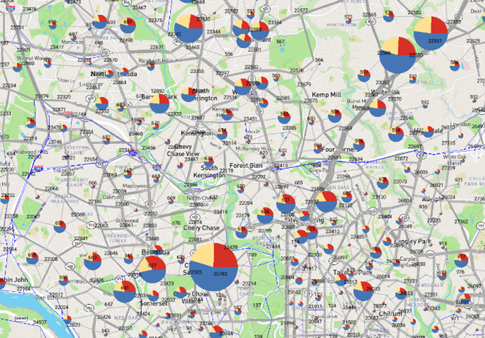
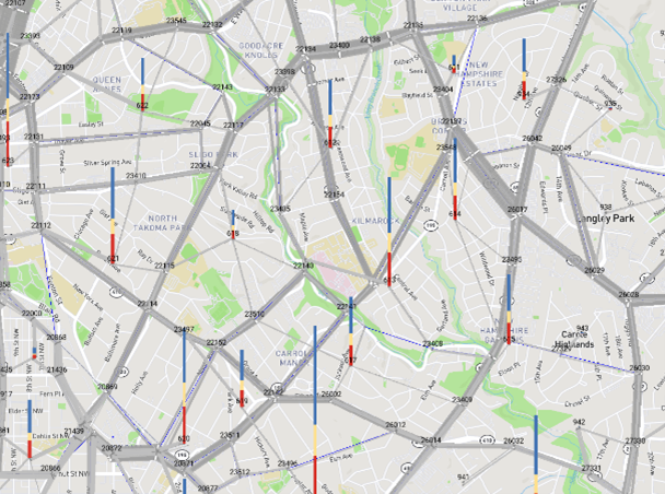
Charting zone data
1. Open Layer Properties window:
2. Node tab tab
3. Click on Add Category to add a category based on a variable or field:
a. Right-click/ click on the color box for the first variable/field:

i. Click on the Variable drop-down to display all the
available fields and variables (matrices and tables) that can be used for the
chart.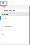
The variable will now be displayed in the corresponding box:
ii. Click on the color box to Open the Select Color window
and pick a Color>
OK
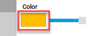
iii. Use the dragger next to the color box to adjust the opacity.
iv. To submit changes, click on the following:
![]()
b. Click on the empty variable box to display the field
drop-down:![]()
i. Select the appropriate field from the list
ii. Click on the color box to change the color and opacity.
4. To add a New variable:
Click on New variable to select either:
a. From Matrix:
The Matrix variable Definition will open:
- Type in the matrix name
- Click on the browse symbol to Open File Explorer to look for the Matrix file
- Click on the drop-down to select the appropriate table from matrix file.
- Select which values from the matrix you want CUBE to use:
- From the Method drop-down select the Method you want to apply:
- Click on Add
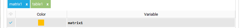
The matrix will be added below the toolbar. Double-click on
it to modify it.
![]()
b. From Table:
The Table Variable Definition window will open:
- Type in the name to assign to the table.
- Click on the browse symbol to Open File Explorer to look for the table file.
- You can enter a query definition in the box if needed.
- Select the appropriate Zone field from the list available under the drop-down.
- Select the value field from the drop-down
- Click Add
The table will be added below the toolbar. Double-click on
it to modify it.
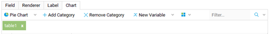
5. Click on Pie Chart to customize the
Chart:
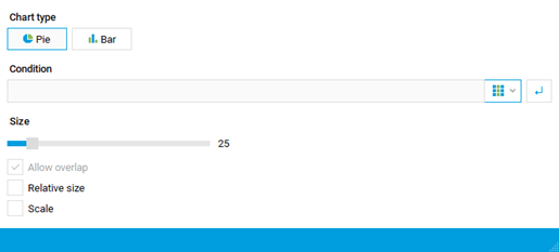
- Select if you want a Pie or
Bar Chart
- If needed type a condition
in the box and use the drop-down to display the available fields and variables.

- Use the size dragger to adjust the chart size.
- Click on the Relative size to adjust the size of the charts according to their values.
- Click on Scale to size the charts relative to the Zoom level.
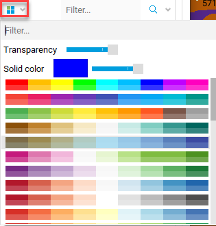
6.
Click on the following symbol to display pre-defined color
palettes that can be applied for the charts: