Report Designer Dialog
This dialog lets you create your own custom report formats.
Accessed from:- Clicking the Edit Report Template option from the Output Manager.
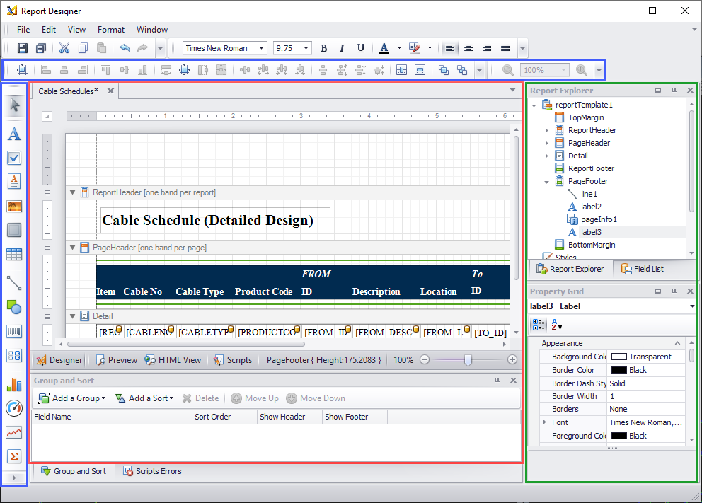
Menu Bar
| Setting | Description |
|---|---|
| File Menu | Displays various options to save and close the report template file. When you use the Save As option, you are prompted with the Save Report Template dialog providing the ability to specify a name and location for the report. |
| Edit Menu | Provides standard editing functions to be applied to items in the report template such as Cut, Copy, Paste, etc. |
| View Menu | Provides different view options for the active report template (Designer view, Preview, etc.) as well as options to display toolbars, and different editing windows in the Report Designer. |
| Format Menu | Provides various formatting options to use when editing the report template such as Foreground/Background color, font settings, spacing etc. |
| Windows | Offers different layout options for the designer windows. |
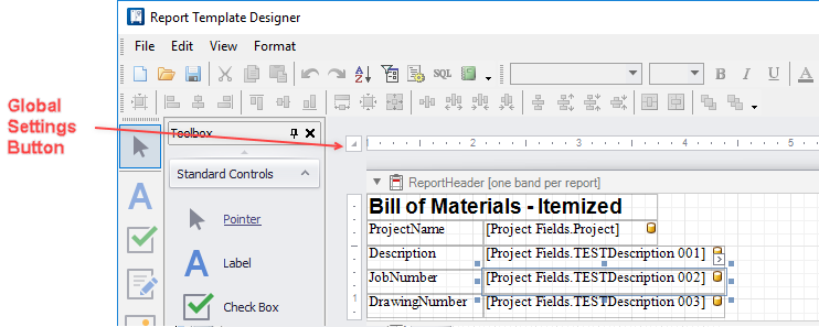
Toolbars
Outlined in blue above, the toolbars provide a selection of standard controls that you can drag into the report template. To use them, drag them into one of the bands in the report formatting area. Once there, you can select them and format them in the Property Grid tab like other report elements.
All of the toolbar options can either be docked, or left floating in the working area.
| Setting | Description |
|---|---|
| Pointer | A tool that allows you to select bands and report elements. |
| Label | Inserts a label in reports. Use this control to place single-line or multi-line text in a report. |
| Check-box | Inserts a check-box in reports. Use this control to allow a user to display a true/false or Checked/Unchecked/Indeterminate state. |
| RichTextBox | Inserts a control that can be used to display, enter, and manipulate formatted text. |
| PictureBox | Inserts a control that can be used to insert images into your report. |
| Panel | Inserts a control that can contain other controls. Use this control to group controls together which makes it easier to manipulate them. |
| Table | Inserts a table into the reports. |
| Line | This control places a line in your report. |
| Shape | Inserts a shape into the report. The type of shape can be defined in the Property Grid. |
| Barcode | Represents a barcode in reports. |
| ZipCode | Inserts a control that displays a zip code in a report. |
| Chart | Inserts a chart in reports. Use this control to show different data in a report using one or several Series View Types. A chart wizard allows you to format the chart once inserted. |
| Gauge | Inserts a gauge graph (data presented in a semicircular dial)into the report. |
| Sparkline | Inserts a sparkline (small line graph) into the report. |
| PageInfo | Use this control to display auxiliary information on report pages such as page numbers, the current date or user information. |
| PageBreak | Inserts a page delimiter into the report. |
| Subreport | Subreport controls are used if there is a particular report structure that needs to be included in many reports and it needs to have a consistent appearance and functionality. A good example is a report header that always contains the same company information, who generated the report, the date, etc. |
Report Formatting and Preview
The central area of the dialog (outlined in red above) is where you place and arrange the elements of the report. Select the Designer tab at the bottom of this area when you are placing or editing report elements.
The report formatting area is divided into horizontal bands that represent different parts of the report page (header, body, footer, etc.). Select the Preview or HTML View tabs when you wish to see what the report output will look like. If you have a page open, data from that project will appear in the preview.
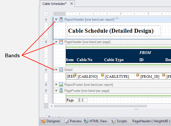
The following types of bands are available. Note that the title bar of each band informs you of how many bands of that type are permitted.
| Setting | Description |
|---|---|
| TopMargin | The area defined by the top margin value. Used for placing content at the top of each report page. |
| ReportHeader | For content that will only appear at the beginning of the first page of the report, below the top margin. |
| PageHeader | Used for placing content at the top of a report page, below the TopMargin. Mainly intended for displaying the header of a table, which has been continued from the previous page. |
| Detail | The main content area of the report. |
| GroupHeader | A header for a sub-section of data within the Detail band of the report (example: one cable within a field wiring report). The group header appears above the Detail band. |
| GroupFooter | A footer for a sub-section of data within the Detail band of the report. Appears below the Detail band. |
| ReportFooter | Used for placing content at the end of a report. |
| PageFooter | Used for placing content at the bottom of a report page, above the BottomMargin band. Mainly intended for displaying the footer of a table, which is continued on the following page. |
| BottomMargin | An area defined by the bottom margin value. Used for placing content at the bottom of each report page. |
Standard Controls
The Standard Controls toolbox contains the controls that can be placed within the report. To add a control to one of the report Bands, click a control type and use the mouse to pick the location for the control and to re-size if necessary.To enter text in a control box, double-click inside the box and type in the text.
Use the Properties Grid to define information for the control as necessary.Report Explorer
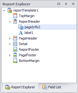
Outlined in green on the right side of the dialog above, is an area that has several purposes. Select the Report Explorer tab to see an outline view of the report's structure and the elements used in the report.The Report Explorer section provides a tree view of the items inside of the current report. It allows for quick selection of the different controls in the report. Any control that is added to the report will be listed here. You select the control just by clicking on it here and it will become highlighted in the report. This will also load the control into the Property Grid for more detailed editing. The Report Explorer also lists the headers, footers and bands along with the other general items added to the report. You can use this view to select individual fields or controls and view their properties or delete them by means of the right-click menu.
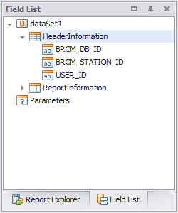
Field List
This is a list of all the available fields from the data. The classes that were selected in the Create Report process should appear as the top node while the properties for each class should show up under them. You can either assign the property to an existing label or tool from the Tool box detailed above or simply drag a field onto the Design Area. This will place a label that is linked to that field. The fields also show what type of data they are in the icons. There is also a field called Parameters but this is used when a report needs a value defined at run time of the report, such as a time stamp.
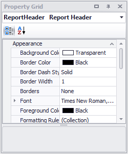
Property Grid
This area gives the properties for a selected Tool. These properties can be modified here. For example, if a label needs some padding, it can be set under the "Padding" property. Some properties use pull downs to have their data changes while others have text fields or special popup windows. Testing each one should show how they work. Most of the properties show a description in the bottom grey area of the dialog when they are selected.
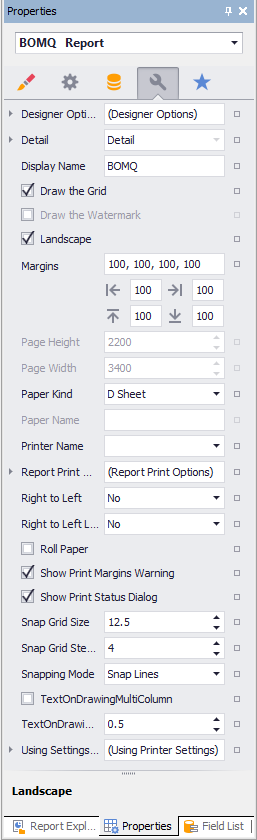
Global Settings for the Report
When you select the button, a limited group of fields will appear beside the button. However, you can select the Property Grid tab and access all global settings for the report.
| Setting | Description |
|---|---|
| Landscape | Select True in this field if you wish the report to be in landscape mode. Select False if you wish the report to be in portrait mode. |
| Margins | Sets the page margins for the report. If you click the + icon beside the Margins field, you will see separate fields for top, bottom, right and left margins. |
| PageHeight, PageWidth | Set the paper size here. Units are hundredths of an inch or tenths of a millimeter as set in the Report Unit field. |
| Report Unit | Here you select whether the space units you enter for margins, paper size, etc., will represent hundredths of an inch or tenths of a millimeter. |
| TextOnDrawingMultiColumn | If the template is for a Text on Drawing report, select True if you wish the report to occupy multiple columns on the drawing page. Select False for the report to appear within a single column. |
| TextOnDrawingSpaceBetweenColumns | If the template is for a Text on Drawing report that will occupy multiple columns on a drawing page, enter a value for the gap between columns. |