Data Visualization
Creating thematic displays with Data Visualizations.
Data visualization is the color-coding of a model based on distinct values of a particular object property. With data visualizations, you can ask questions like, "Which objects in the model are associated with particular engineering disciplines?" or "What is the delivery status of the various pieces of equipment?" and see the answers graphically.
Some Bentley products like ConstructSim Planner create i-models with built-in data visualizations, but you also can create them manually.
All data visualizations,
both stored in the i-model and user-created, display in the Data Visualization
tab of the Content Management zone in the middle left. To apply a data
visualization, select it from the list. A checkmark displays next to the data
visualization name when a data visualization is applied. Only one visualization
can be displayed at a time. To clear the currently displayed visualization,
select its name again. The More Options
 icon displays to the right of
each data visualization name in the list. When you select the More Options
icon, you can select Delete to delete the data visualization, and you can
select Share to share data visualizations between devices or with other users
in your CONNECT Project. When a data visualization is shared, the Shared
icon displays to the right of
each data visualization name in the list. When you select the More Options
icon, you can select Delete to delete the data visualization, and you can
select Share to share data visualizations between devices or with other users
in your CONNECT Project. When a data visualization is shared, the Shared
 icon displays to the left of the
data visualization name. Shared data visualizations can be synced with other
members of your CONNECT project by selecting the Sync button from the Backstage
Panel.
icon displays to the left of the
data visualization name. Shared data visualizations can be synced with other
members of your CONNECT project by selecting the Sync button from the Backstage
Panel.
When you open an i-model published from ConstructSim Planner, any status visualizations created in ConstructSim Planner appear in the Data Visualization tab as data visualizations.

Creating a Data Visualization
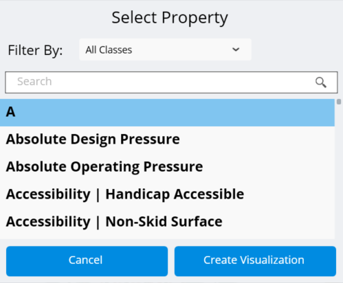
There are two ways to create a data visualization, select by property or visualize Find Similar search result. Either method starts by opening the Data Visualization tab from the Content Management zone. To select by property, select the Add "+" button from the tool bar.
When you select the Add button, a dialog opens to allow you to select a property. This list shows every property in the model. The class of property displays in the brackets after the name to make sure you select the desired property. Once you select the property, select Create Visualization. This visualization finds all unique values for this property and assigns it a color when applied.
To visualize a Find Similar search result, select an object in the model. From the Properties zone in the bottom right, right click one of the model's properties and select Find Similar. Models with that property display in the Search Results tab of the File Browser zone in the middle right. Then select the Add button from the Data Visualization tab tool bar. You are asked to select a color which will be associated to that search result. Select Visualize to apply the data visualization.
Applying a Data Visualization
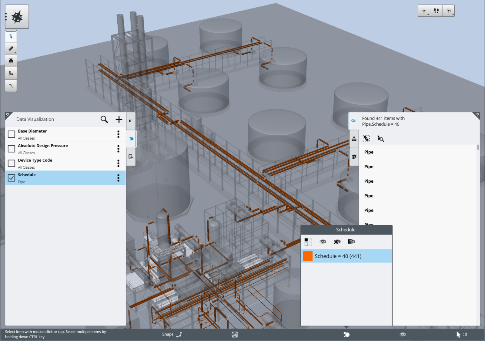
Applying a data visualization is very simple; select the data visualization from the Data Visualization tab in the Content Management zone. The view updates by changing the color of items based on the data visualization selected. Items not part of the visualization display as grey and transparent. A new icon displays in the Status Bar on the bottom edge. When you select this icon, a Data Visualization Legend tab displays the legend that is used to describe the value assigned to the items. From the legend, you can select individual rows to hide those items from the view. From the tool bar in the tab, you can click Isolate to hide all items that are not part of the visualization. You can also select Show All or Hide All to show or hide all the items in the data visualization. To invert the selection of rows in the tab, you can select Invert Selection from the toolbar.
While a data visualization is active, you can use all other tools in Navigator like navigation, measure, sections, or applying a saved view. The data visualization stays active until you select the tile again to turn it off or close the file.